DOMAIN EXPERTISE
Every website has a story. Mine has a few too many. These are the screenshots.
Scroll through time to see every version of aliciahurst.com from 2006 to the present.
2006
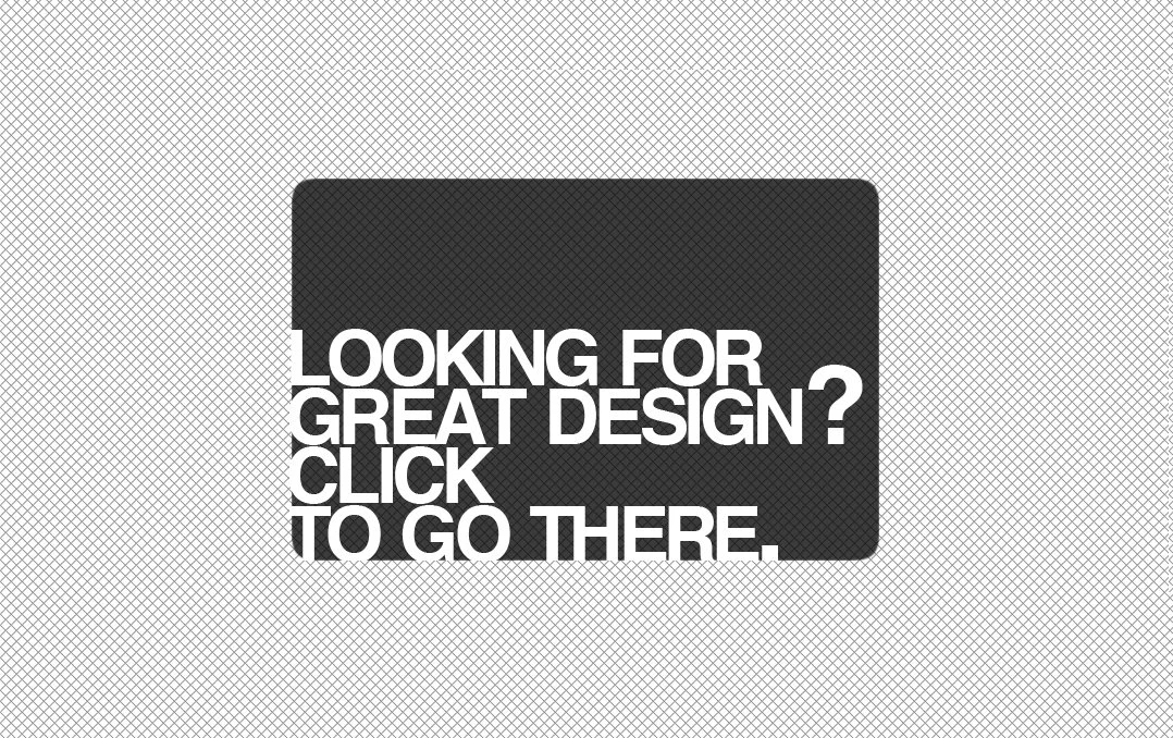
Raw HTML & CSS—I bought this domain in 2006, my fifth one already and I was barely a legal adult! Before launching anything here, I threw up this weird placeholder: a bold black box over a crosshatched background, linking somewhere I’ve long forgotten. All my previous websites were personal and for fun, but aliciahurst.com would become my professional home online.
2008
Raw HTML & CSS—The first real version of aliciahurst.com. The chaotic typography combo! The horizontally scrolling frame! Both regrettable and kind of cool at the time.

2009
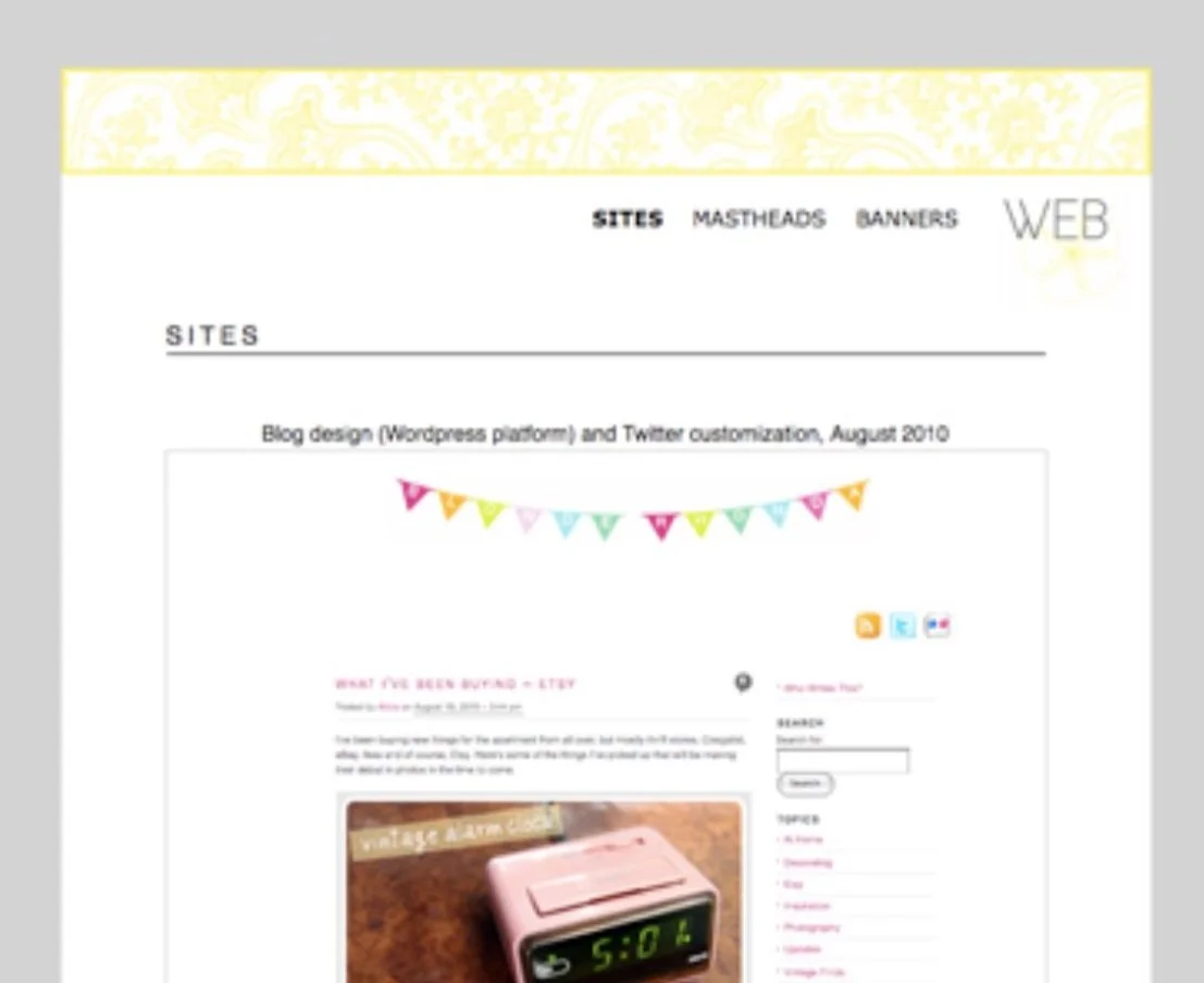
Raw HTML & CSS—A period aesthetic that I don’t know how to describe. I was about to graduate college, hadn’t yet designed professionally, and used this site to show off artwork and blog headers.

2011
WordPress—I moved back to WordPress when I started freelancing. I’d used it since its 2001 debut, when it was still called b2/cafelog. Unfortunately, I also chose clashing graphics and the most questionable font pairing of my life. This is where the embarrassment really begins!


2013
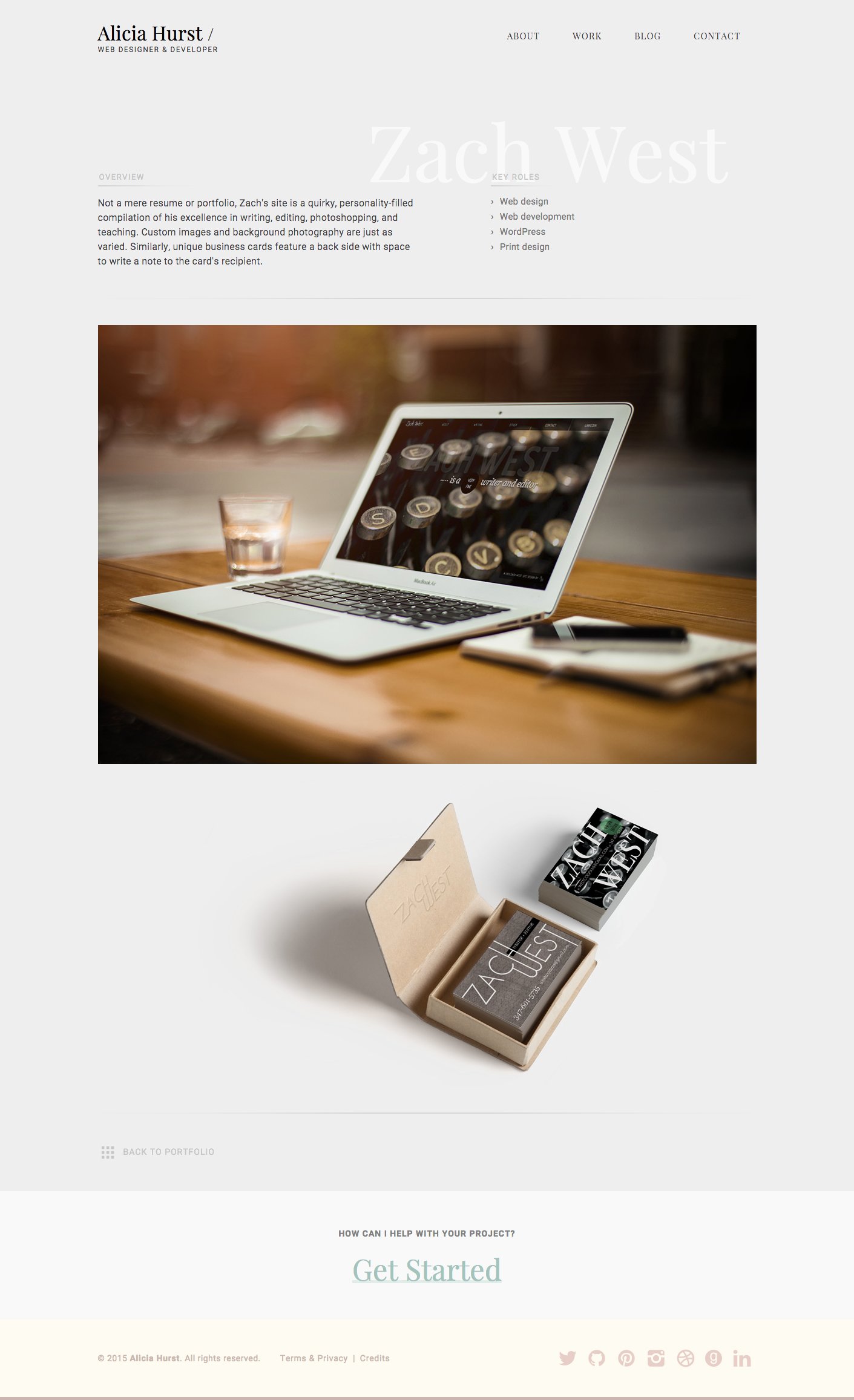
WordPress—Not my strongest era. The palette was muted, the design concept a little overambitious, and the layout was pretty experimental. But I did have a nice all-caps serif and a monogram A logo I liked, good enough to make some stylish business cards using my own photography.
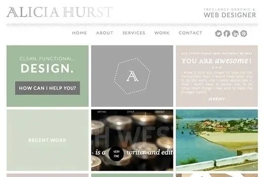
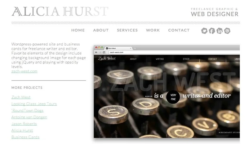

WordPress—My website was performing well in organic search, and I was hitting my stride: writing helpful blog posts, educating small business owners, and dialing in the tone. Every page had strong CTAs, testimonials, and the kind of writing I now recognize as early product thinking. “Why I love my clients” might’ve been a positioning statement before I even knew the word.
2014


Raw HTML & CSS—Before the new site was live, I put up a single-page placeholder accented with marigold. I also designed a business card pattern I liked so much, I borrowed it from a client project and made it my own.


2015
WordPress—This brand identity was a contrast between a brushy script and a thin sans-serif, set against a strict vertical split layout, maybe a nod to my design/dev duality at the time?


WordPress—I barely remember this one, looks like I used it for a few months between major visual identities. Clean, serif-heavy, hand-constructed WordPress theme as ever.
2016
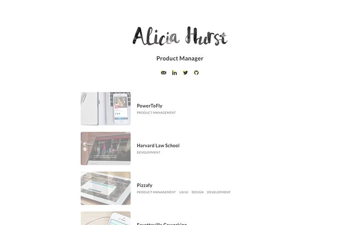
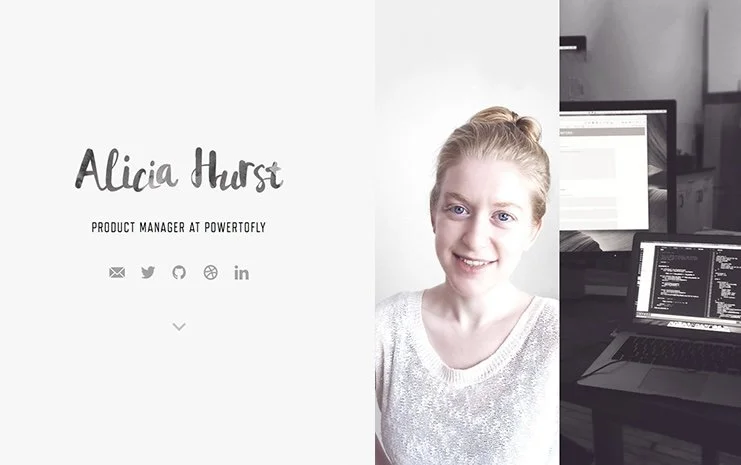
WordPress—By this point, I had become a product manager. The site used a visual identity I’d created in 2015 (more below) and my Home page became less elaborate as I phased out design project highlights.


2018
Squarespace—After 17 years on WordPress, I switched platforms and left this minimalist placeholder up for a while. Just a quote, a coffee mug stock photo, and some social links.

2019
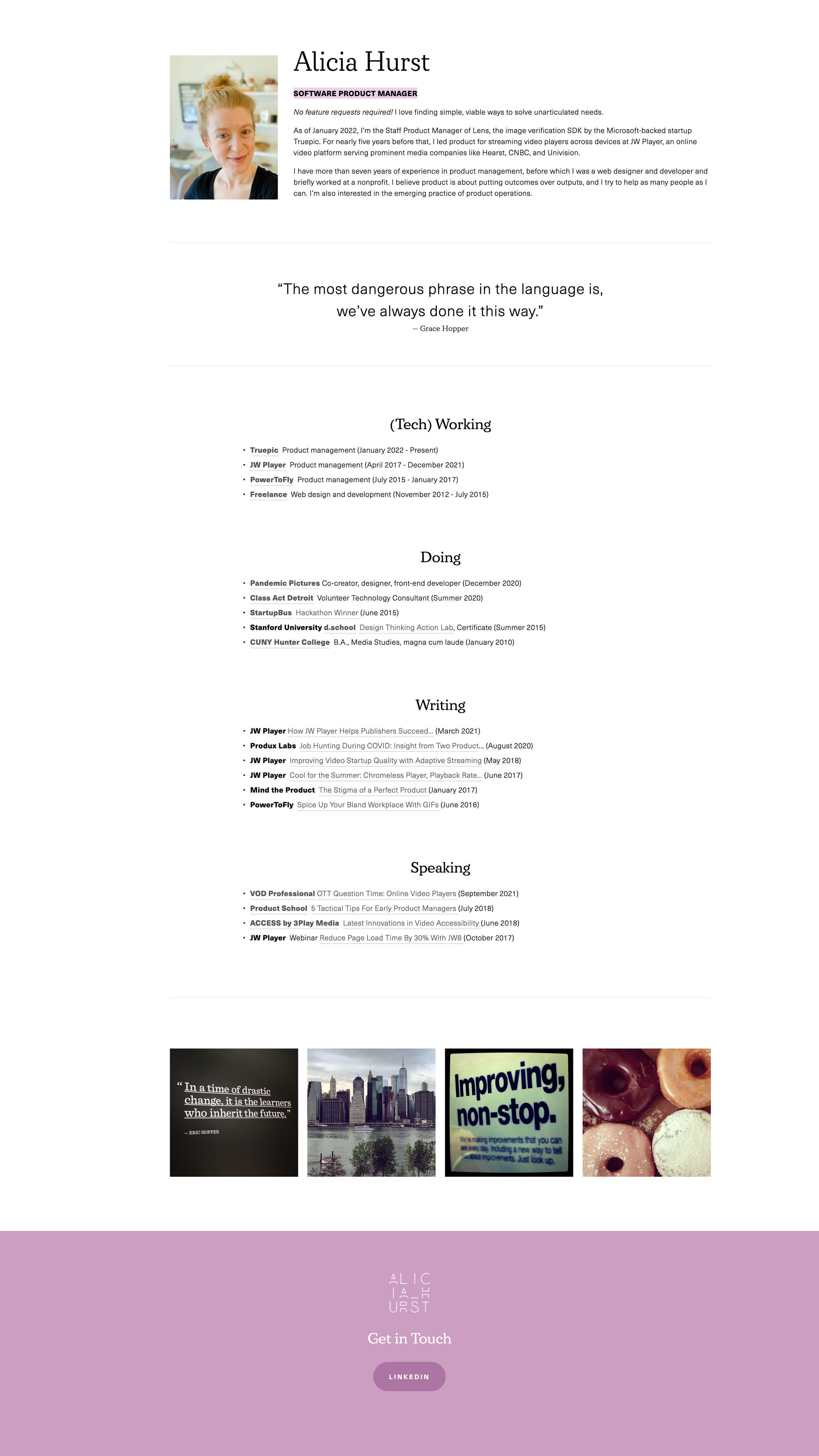
Squarespace—Began my single-page era. I linked to recordings of talks, side projects, and corporate blog posts, plus favorite quotes and photos that felt like a snapshot of me personally.

2023
Squarespace—Two years of variations on a theme: simple, single-page with the same basic info. You probably could’ve learned more from my LinkedIn!

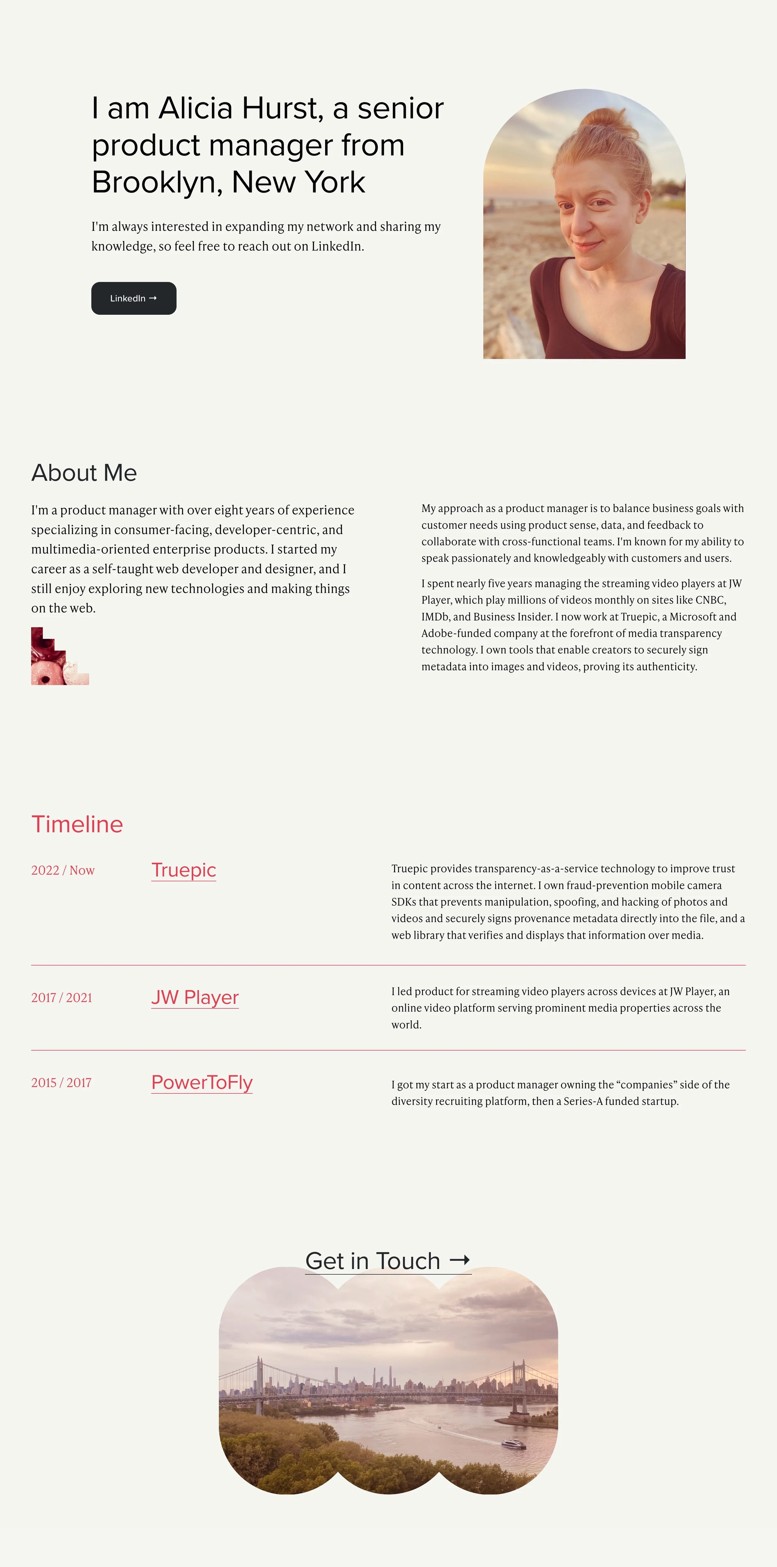

2025
Squarespace—It was intimidating to relaunch my site with content focused on product management, the first time I’ve done so since moving into the role a decade ago. Few product people keep websites, but I missed having a portfolio and blog like I did as a web developer. I wanted to bring a personal side to the design, so I experimented with green (a staple in my wardrobe) and a softer look, inspired by a few websites I was attracted to at the moment. But that didn’t last; it quickly felt too muted and botanical for my tech-heavy online presence.


GET IN TOUCH
Need website help?
I’ve been designing and building sites since 1999, and I continue to take on select website projects. My current work focuses on replatforming and redesigning existing sites on Squarespace for clearer structure, stronger positioning, and improved visibility.
