Authority by framing: an informal study of Zoom presence
It started during the pandemic, of course. I began noticing that some people’s on-camera appearance genuinely impressed me. I enjoyed looking at them on screen. Their video felt clear and balanced, like we were in the same room. That clarity seemed to improve our ability to communicate. There was less friction, more trust. I didn’t know exactly why, but I noticed it again and again.
My own video feed didn’t look like that. I didn’t have great natural light, the image often lacked contrast, and the color balance was always slightly off. I was already self-conscious because I’m a youthful-looking woman. In life, that’s fine. In work, it’s complicated. People often assume I’m younger than I am, and trust me less as a result.
As I stepped into more senior and leadership roles, it became more important that people saw me not just someone capable of producing work, but someone whose judgment they could trust. But on camera, I still felt like I was giving IC.
So I made it a priority to care. Not because appearances are everything, but because in a remote-first world, they do matter—especially when you don’t match people’s mental model of what authority is “supposed” to look like.
I started studying Zoom appearances the way I study product strategy: systematically. I took screenshots and tracked patterns. I tried to figure out what exactly created the impression of leadership, and what didn’t seem to matter.
This post is more of a personal reflection on what I learned than a set of rules. I’ve included public domain images from Wikimedia Commons to show what I mean.
3 signals of leadership (to me)
1. Image clarity and lighting
What immediately stood out to me was contrast and brightness. The most effective setups have:
Realistic contrast creating clear separation between skin tone, hair, and clothing, just like you’d see in real life. Many people’s video feeds come through gray or muddy, and that instantly affects how trustworthy they seem.
A bright face made people feel more authoritative. Not spotlight-level brightness, just clear, natural light that gave their skin a bit of dimension. A slight dewy quality, which has nothing to do with makeup and everything to do with lighting, made people look polished and well-lit.
I also found that a cool-white color balance, rather than a warm or yellow tint, gave the most professional, high-resolution look.

Einsamer Schütze and Mike appear gray with low contrast; others are too much in shadow. Rote4132 and Rabe.dd look most real-world to me. (Image source)
2. Positioning
This one surprised me: my perception of someone’s “leader-ness” directly correlated with where their eyes landed in the frame. If their eyes were below the horizontal center line, it often felt less confident—like they were looking up from a laptop camera, or hadn’t thought about framing at all. I associate that look with early-career folks. Not because of age, but because of visual habits.
The strongest presence came from people who had their eyes above the center line, and whose heads were tightly framed with very little space above their hair. It felt intentional and in control.

Two men of approximately the same age. One looks trusthworthy and polished, the other looks like an amateur. (Image source)
3. Background
This was the biggest pattern I noticed. If someone’s background was tilted—like the camera was pointing slightly up or down—it instantly read as less credible. It gave a distorted, wide-angle look that made everything feel ungrounded. The strongest visual signal came from people whose background was perfectly level and straight back. It didn’t even matter what the background was—a neutral wall, a bookcase, an office. What mattered was the angle. A centered, stable backdrop made people look buttoned-up and composed.
I also noticed a lot of people using virtual backgrounds to fix this. Sometimes they used a solid color, sometimes a clean office stock photo, but in both cases, it helped maintain a consistent, polished presence. I once watched someone toggle theirs off mid-call and reveal the angle of their office behind them, and I felt their perceived polish drop instantly. They turned it back on a minute later.

The background angles of Sherry (top row, second from left), Abe (bottom left corner), and Prithwiraj (rightmost on bottom row) distract me and make them seem less senior. Denise, Phil, Omri, and Jo have straight, professional backgrounds, which look more senior. Two people use virtual backgrounds, fixing awkward angles. Linda's image is clear, but Karin (top left) has low eye positioning. (Image source)
What didn’t matter
These were things I assumed made a difference, but didn’t.
Age – I thought having a more mature face would automatically signal authority, but it doesn’t. I consistently saw people a decade older than me who came across as early-career, not because of their face, but because of bad lighting and desaturated video. As you can see from the screenshots I’ve shared, authority doesn’t come from your features, it’s about how clearly people can see and interpret you.
Hairstyle – I also assumed that for women, styled hair would make a difference. In practice, it had no impact. Hair up, down, curled, not—none of it correlated with how competent or senior someone appeared. Same for men.
Title – You’d think that anyone with a director or VP title would have figured this out by now, but many haven’t. I’ve seen plenty of executives with poor setups. It didn’t take away their title, but it did soften their presence. Just because you’re senior doesn’t mean you appear that way.
Tools I recommend
Here’s what I use or suggest for getting your setup closer to intentional.

My top recommendation. It works with any video conferencing app and lets you control ISO, brightness, contrast, saturation, white balance, and zoom from any webcam. The difference is huge. It’s the reason I could fix my lighting and contrast without changing hardware.
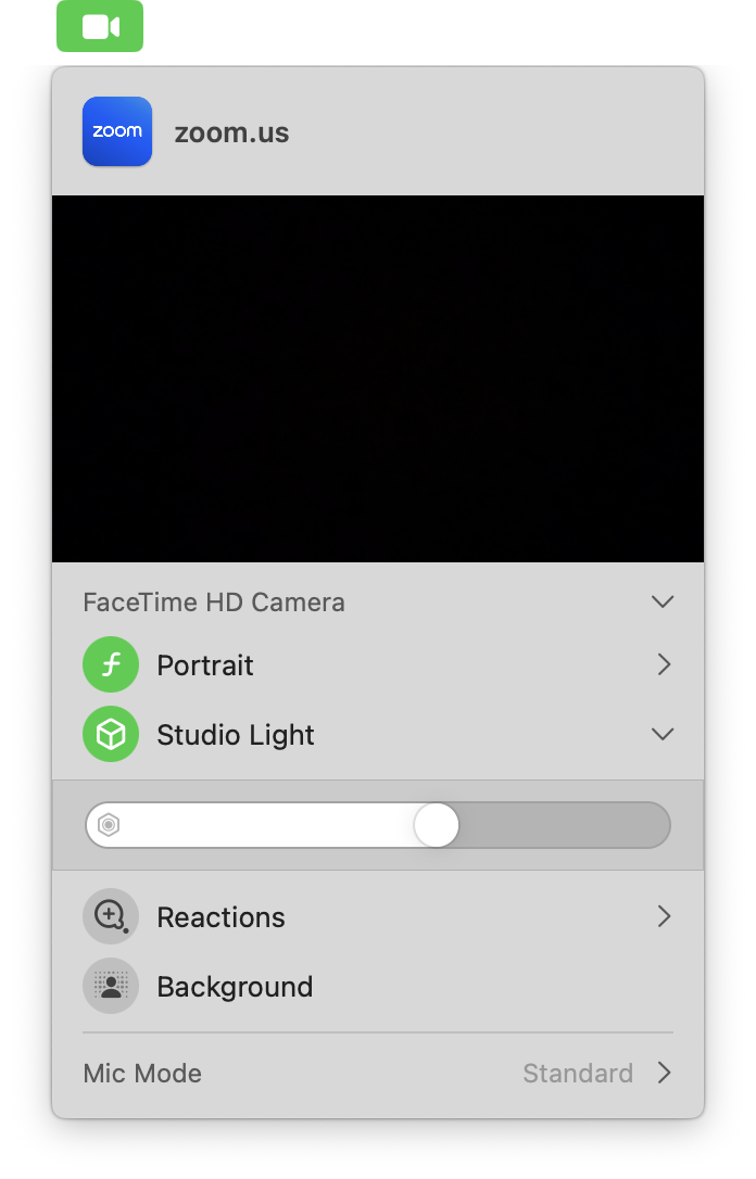
Native camera effects
If you’re on a Mac, the new “studio light” and “portrait mode” options in your menu bar (accessed via the camcorder icon with the green background) are great. I like Apple’s built-in backgrounds too—they’re abstract and bright, and they match natural lighting angles surprisingly well.
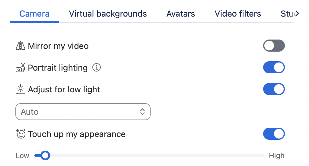
Zoom + Google Meet settings
Both platforms now have built-in tools like touch-up filters, brightness adjustment, and background blur. Zoom in particular gives you fine-grained control over appearance and lets you upload branded or minimal backdrops.
Final thoughts
We all want to be seen clearly, especially when we lead from a place of thoughtfulness, not bravado. While I’m not an expert, I don’t believe you need to look a certain way to be a leader. But I do believe you send a signal every time you show up on screen.