Some things change, some things I love just the same
Back in April, I relaunched my website and started blogging for the first time since I went into product management. I posted a few times, then got swept into interviewing for full-time roles, ready to find a new team and roadmap. But before I could accept a role, something abruptly shifted in me.
After ten years of managing products, I still had deep feelings for the craft, but I really wanted to help companies build better. I felt an urge to step back from the churn of weekly priorities to focus on leadership and alignment. So I became a consultant and fractional leader.
I took on my first client, and the work gelled for me immediately. This model gave me a way to be more strategic, highly efficient, and exactly what early-stage companies need.
In personal conversations though, I kept running into a strange assumption. When I’d mention consulting, people would nod and say something like, “That’s a great way to buy time during the search.” As if this were a gap-filler. It’s not. This is the thing—an honest take on what product leadership requires, from the outside in.
I’ve stopped responding to full-time recruiter messages entirely. I’m building a practice, not passing time until something better comes along. And that meant it was time, again, to redesign my site to reflect what I’m doing now and why. That process turned out to be more recursive than I imagined, which now seems perfectly fitting.
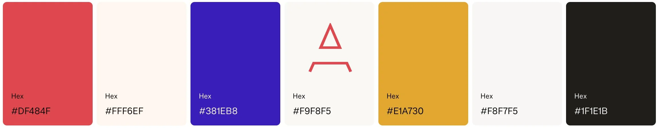
First, a return to a bold A lettermark from a font called Lombok. I had used it on a business card back when I was freelancing making websites, before I ever worked in tech. I used to be embarrassed about that period because I didn’t have the experience to justify working for myself. But I feel a sigh of relief in reclaiming a symbol from a time I once cringed at, just as I step into a new iteration of independent work.
A similar thing happened with color. I pulled a red from a UI accent and a blue I used on a button two years ago. I briefly tried to replace this palette with green earlier this year, only to come back to colors that already felt like (digital) home. There’s something satisfying about growing into, not out of, these choices.
This new chapter of my career is about continuing what has always felt right, guided by an even clearer vision. It’s about helping companies find their footing while creating a way of working that finally feels like mine.
Additional credits
I first noticed the heading font Degular on BackBIPOC’s site, which was featured in Squarespace’s showcase. It struck the right “tech but approachable” balance I was going for, so I used it here too.
I was stuck on layout ideas when I came across Social Impact Capital’s website— which coincidentally uses almost the same blue—and I instantly loved it. I knew I couldn’t (and shouldn’t) recreate it exactly, but I tried to capture that spirit, especially on my homepage.
Illustrations are from Canva. All photography is my own.